About Ruiyang
Contact Us

8:30~11:30 / 13:00~17:00

Qiangbu Village, Nandu Town, Liyang City, Jiangsu Province, China
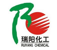
Corporate logos
- Categories:About Ruiyang
- Time of issue:2017-06-16 00:00:00
- Views:0

1, the overall visual effect is a Chinese character "yang", it represents the sun, healthy, positive up.
2, the left side of the ear that is "Rui" Pinyin R deformation, but also "Yang" word left side of the Chinese calligraphy book body, "auspicious" and "masculine" inclusive meaning. Green represents faith, business, environmental protection, life, harmony, it is the company logo system base color.
3, the right side of the Japanese design next to a tooth-like red day, meaning the company continued to improve, the cause of the rising sun, the pursuit of endless. Red represents mission, passion, creation, lead, and enterprising.
4, Chinese characters "Ruiyang Chemical" and the English "RUI YANG CHEMICAL" is the company's abbreviation and abbreviation. It shows the company's industry positioning and international brand positioning. Black on behalf of low-key, calm, black and white clear, strict, self-discipline.
5, the logo as the company's registered trademark of the main, applied to the company's products, image logo and corporate culture. Green, red and black colors are commonly used in corporate culture.
COPYRIGHT © 2021 jiangsu kailin ruiyang chemicai co.,LTD 苏ICP备17028588号-1 www.300.cn Changzhou IPV6


